Mobile-Friendly Website Development Guide for Indian Businesses
A practical guide for Indian businesses that want mobile-friendly website development with responsive layouts, fast loading, service pages, landing pages, contact forms, WhatsApp buttons, SEO-friendly structure, and better enquiries.

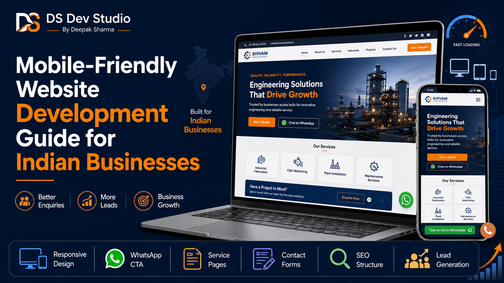
Mobile-Friendly Website Development is essential for Indian businesses because many customers visit websites from smartphones before making a call, sending a WhatsApp message, filling a contact form, or visiting a shop or office. A website that looks good only on desktop is not enough anymore. Indian users often open business websites through Google Search, WhatsApp links, Instagram, Facebook, LinkedIn, Google Business Profile, ads, referrals, and direct messages. If the mobile experience is poor, the business may lose enquiries before the visitor understands the service.
A mobile-friendly website should load fast, look clean, show readable text, have easy navigation, display clear service details, and make contact simple. Visitors should not need to zoom, scroll sideways, or search too much for phone number, WhatsApp button, service pages, or enquiry form. A good mobile website helps Indian businesses build trust and convert visitors into leads.
Many small businesses in India still use websites that were made only for basic online presence. Some websites have small text, old layouts, broken menus, heavy images, slow loading, confusing forms, and weak mobile design. These issues create friction for users. A Responsive Website Developer can rebuild or improve the website so it works properly across mobile, tablet, laptop, and desktop screens.
DS Dev Studio by Deepak Sharma helps Indian businesses with mobile-friendly website development, responsive website development, business websites, service pages, landing pages, React frontend development, WordPress customization, contact forms, PHP backend systems, API integration, admin panels, CRM modules, MySQL databases, and custom web applications. This guide explains how Indian businesses can plan and build a mobile-friendly website that supports better user experience and lead generation.
What is Mobile-Friendly Website Development?
Mobile-Friendly Website Development means building a website that is easy to use on smartphones and smaller screens. The layout, text, images, buttons, menus, forms, and service sections should adjust properly according to screen size. The website should remain readable, fast, and simple to navigate without requiring zoom or horizontal scrolling.
A mobile-friendly website is not just a smaller version of a desktop website. It should be planned around mobile user behavior. Mobile users often want quick information. They may want to check services, call, send WhatsApp message, see location, submit a short form, or compare options quickly. The website should help them take these actions easily.
A Website Developer India professional should build mobile-friendly websites with responsive layouts, optimized images, clear CTA buttons, fast loading, readable content, simple forms, and SEO-friendly structure. This makes the website more useful for real Indian business customers.
Why Indian businesses need mobile-friendly websites
Indian businesses need mobile-friendly websites because mobile browsing is a normal part of customer behavior. Whether a business serves local customers, small business owners, students, patients, homeowners, corporate clients, or online buyers, many visitors will first open the website from a phone. If the website does not work well on mobile, the business may lose trust and enquiries.
Mobile-friendly design is especially important for service-based businesses. A customer may search for a web developer, consultant, clinic, coaching center, agency, repair service, real estate service, or local provider from a mobile device. They may quickly check the website and decide whether to call or contact. If the page is slow or difficult to read, they may choose another provider.
A Business Website Developer should understand this journey. The website should be built so Indian users can quickly understand what the business offers, why it is reliable, and how to contact. Mobile experience directly affects business enquiries.
Mobile-friendly website vs responsive website
Mobile-friendly and responsive website are closely related terms. A responsive website automatically adjusts its layout across different screen sizes. A mobile-friendly website focuses on making the mobile experience comfortable, readable, and practical. In most modern projects, both should be planned together.
Responsive Website Development handles technical layout behavior. Mobile-friendly planning handles user experience. For example, a page may technically resize on mobile, but if the text is too small, the form is too long, or the CTA button is hidden, the mobile experience is still weak. A good developer should think beyond layout resizing.
A Responsive Website Developer should test the complete mobile journey. This includes homepage, service pages, landing pages, blog pages, contact forms, menu, footer, WhatsApp links, phone links, and CTA buttons. The website should feel smooth and natural on mobile devices.
Mobile-first planning for Indian business websites
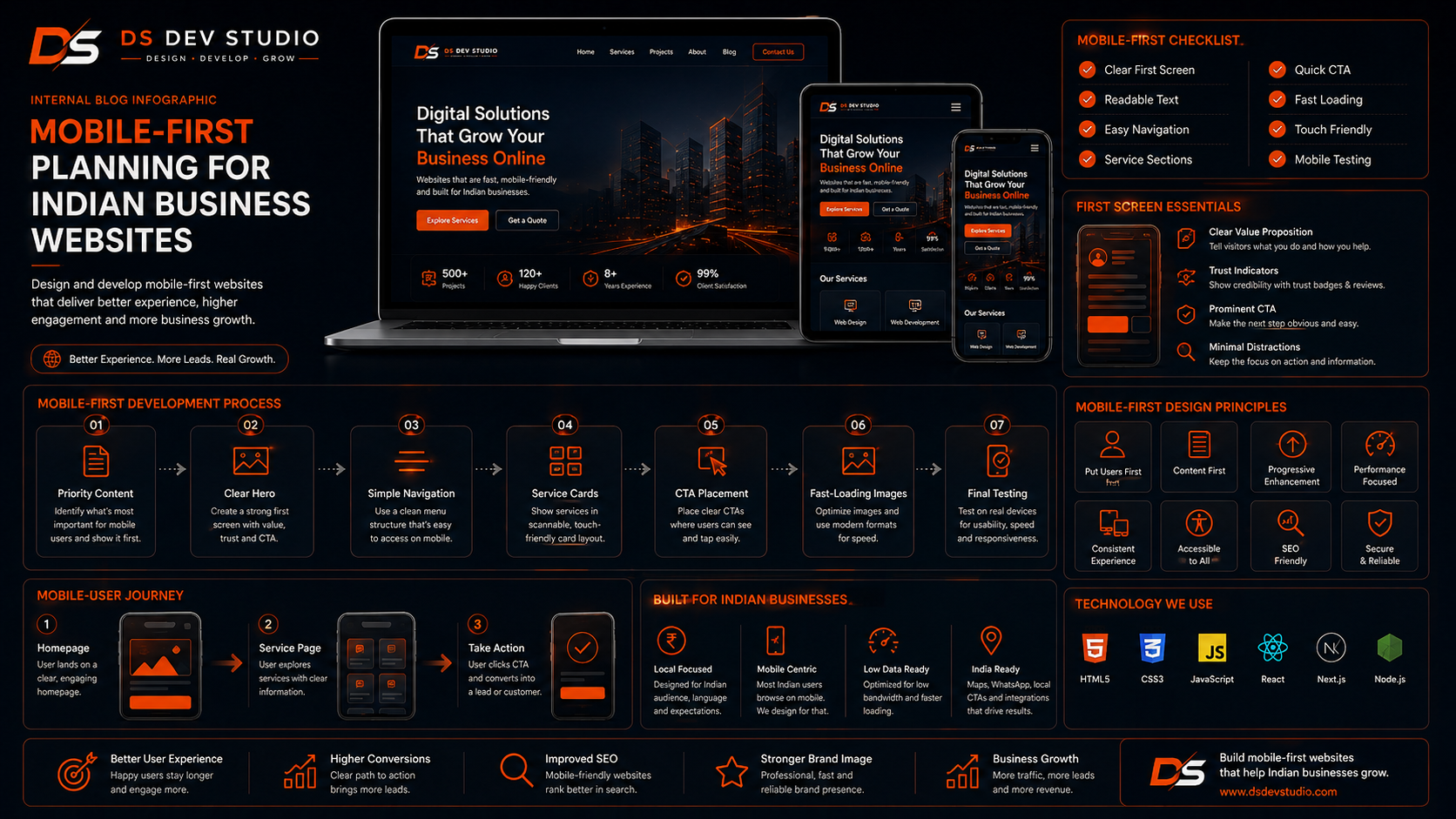
Mobile-first planning means thinking about the mobile experience before desktop design. This is useful for Indian businesses because many visitors may interact with the website mainly from phones. A mobile-first approach keeps the website clear, focused, and easy to use.
In mobile-first planning, the developer decides what information should appear first, how the menu should work, how service cards should stack, where CTA buttons should appear, how forms should be simplified, and how images should load. This prevents the website from becoming overloaded on small screens.
- Keep the first mobile screen clear and direct.
- Use readable font size and comfortable spacing.
- Place important CTA buttons where users can find them quickly.
- Use short forms for mobile enquiries.
- Make phone and WhatsApp buttons easy to tap.
- Use optimized images that load fast on mobile networks.
- Keep service sections simple and easy to scan.
- Test every important page on mobile before launch.
Homepage design for mobile users
The homepage should quickly explain the business on mobile. Indian users may not spend much time trying to understand a confusing website. The first section should clearly show the business name, main service, short value statement, and CTA button. The user should know what the business does within a few seconds.
A mobile-friendly homepage can include a clear hero section, service overview, benefits, process, trust signals, project highlights, testimonials, FAQs, blog previews, and contact CTA. Each section should be short enough to scan but detailed enough to create clarity.
A Website Developer Freelancer should make sure homepage sections stack properly on mobile. Service cards should not be too small. Images should not push important content too far down. CTA buttons should appear naturally after important sections.
Service pages for mobile-friendly business websites
Service pages are important for Indian businesses because visitors often want details before calling or sending a message. A mobile-friendly service page should explain one service clearly with simple headings, short sections, benefits, process, FAQs, and CTA buttons. The visitor should not feel lost while scrolling.
Many small business websites only list services in one short homepage section. This may not be enough. Dedicated service pages help explain each offering properly. They also support SEO Friendly Website Development because each page has a clear topic and structure.
For DS Dev Studio, service pages can include website development, React frontend development, WordPress customization, landing page development, backend development, API integration, admin panels, CRM web applications, and custom web applications. Indian businesses in any field can use the same idea by creating clear pages for each main service.
Mobile-friendly landing pages for campaigns
Landing pages are useful for Indian businesses running ads, WhatsApp campaigns, LinkedIn outreach, Instagram promotions, local offers, or service-specific campaigns. A landing page should focus on one service or offer and guide visitors toward one action.
Mobile-friendly landing pages should have a direct headline, short explanation, benefits, trust points, FAQs, and a simple form. The page should not be crowded with too many links or unrelated sections. Mobile users should quickly understand the offer and submit an enquiry.
A Landing Page Developer can create focused campaign pages that work well on mobile and connect with lead tracking systems. This helps Indian businesses manage enquiries from ads, social media, and WhatsApp campaigns more effectively.
Mobile-friendly navigation and menu design
Navigation should be simple on mobile. A confusing menu can make users leave before exploring services. A business website menu should include important pages such as Home, About, Services, Blog, Projects, and Contact. If there are many services, the menu should still remain clean.
The mobile menu should open and close smoothly. Menu items should be easy to tap. The contact option should be visible. A sticky header can be useful if it does not take too much screen space. Phone or WhatsApp CTA can also be added carefully where relevant.
A Frontend Developer Freelancer should test the menu on different mobile screen sizes. Small navigation problems can create big user experience issues.
CTA buttons for Indian mobile users
CTA buttons are important because they tell visitors what to do next. Indian business websites often need CTAs such as Call Now, WhatsApp Now, Get a Quote, Send Enquiry, Book a Call, Request Consultation, or Start Your Project. These buttons should be easy to find and easy to tap on mobile.
CTA placement should be planned carefully. Buttons can appear in the hero section, after service sections, near testimonials, near FAQs, and at the end of the page. A mobile visitor should not need to search too much for contact options.
CTA text should be clear. For example, “Send Enquiry” is better than a vague “Submit.” “Discuss Your Website Project” may work better for a web development service page. A Business Website Developer should match CTA text with the user’s intent.
WhatsApp and phone integration
WhatsApp and phone integration are very useful for Indian businesses because many customers prefer quick communication. A mobile-friendly website can include WhatsApp buttons, click-to-call links, and phone CTA sections. These features make it easier for visitors to contact without copying numbers manually.
However, WhatsApp and phone buttons should be placed properly. Too many floating buttons can disturb the user experience. The button should be visible but not cover important content. It should also work correctly when tapped from a mobile device.
A Website Developer India professional can add WhatsApp links, phone links, email links, and contact forms in a clean way. These contact options should support the user journey, not distract from it.
Contact forms for mobile-friendly websites
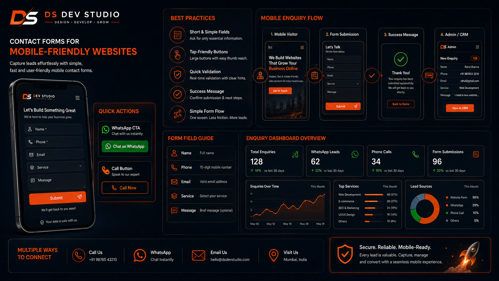
Contact forms should be simple on mobile. A long or confusing form can reduce submissions. Indian businesses should ask only for the information needed to start the conversation. Common fields include name, phone number, email, service requirement, and message.
Some businesses may need extra fields such as location, budget, timeline, preferred contact method, or current website link. These fields should be used only when useful. Too many required fields can create friction for mobile users.
A Backend Developer Freelancer can connect contact forms with email notifications, MySQL databases, Google Sheets, CRM systems, admin dashboards, or API workflows. This helps businesses track enquiries after submission instead of depending only on inbox messages.
Mobile website speed and performance
Website speed matters strongly on mobile. Some users may browse from slower networks or older devices. If a website takes too long to load, visitors may leave before reading services or submitting a form. Mobile-friendly development should include speed optimization from the beginning.
Performance can be improved through optimized images, clean code, fewer unnecessary scripts, lightweight sections, proper hosting, compressed assets, and careful use of animations. For WordPress websites, heavy plugins should be avoided. For React websites, components and assets should be optimized.
A Responsive Website Developer should test page loading and user interaction before launch. Mobile speed is not only a technical metric. It affects trust, usability, and conversions.
SEO-friendly structure for mobile websites
SEO Friendly Website Development should be included in mobile-friendly website planning. A website should have clear headings, clean URLs, useful content, metadata, image alt text, internal links, responsive layouts, and fast loading. Mobile usability and SEO-friendly structure work together for long-term visibility.
Indian businesses should create dedicated service pages instead of putting all services into one crowded homepage section. Blogs can answer customer questions and link to service pages. Landing pages can support campaigns. Internal links should guide visitors from learning to enquiry.
An SEO Friendly Website Developer should build pages that are useful and readable. The website should not force keywords unnaturally. Clear structure, useful content, and mobile-friendly design are more important than keyword stuffing.
Images and visual design for mobile websites
Images should support the website message without slowing the page. Many Indian business websites use large banners and uncompressed images that make mobile pages heavy. Images should be resized, compressed, and placed carefully so they improve design without damaging speed.
Mobile visuals should not hide important content. If a large image appears before service details or CTA buttons, users may need to scroll too much. A mobile-friendly website should balance visuals and information. Service cards, icons, project images, and testimonial sections should remain readable on small screens.
A Custom Website Developer should use consistent design elements such as headings, cards, icons, buttons, spacing, and colors. A clean layout usually works better than a visually overloaded page.
Mobile-friendly blogs for Indian businesses
Blogs can help Indian businesses grow online visibility, but blog pages must be easy to read on mobile. A blog with long text blocks, small font, poor spacing, and heavy images can make users leave. A mobile-friendly blog should have clear headings, readable paragraphs, internal links, and CTA sections.
Blogs can answer customer questions, explain services, share guides, compare options, and support service pages. For example, a business can publish blogs about website planning, website redesign, service page development, contact form development, API integration, CRM systems, and responsive design.
A WordPress Developer Freelancer can create blog templates for easy publishing. A React Developer Freelancer can create custom blog layouts with reusable components. In both cases, mobile readability should be tested before launch.
WordPress mobile-friendly website development
WordPress is useful for Indian businesses that want easy content management, blog publishing, service page editing, and dashboard control. A WordPress Developer Freelancer can build mobile-friendly WordPress websites with customized themes, responsive layouts, contact forms, service pages, blogs, and landing pages.
WordPress websites should be optimized carefully. Heavy themes and too many plugins can slow down mobile performance. The developer should keep the setup clean, optimize images, configure forms properly, and test responsiveness.
WordPress is practical for small businesses, consultants, local providers, agencies, and service businesses that plan to update content regularly. It should still be developed with mobile experience and SEO-friendly structure in mind.
React mobile-friendly website development
React is useful for Indian businesses that need custom frontend design, reusable sections, landing pages, API-connected forms, dashboards, and modern interfaces. A React Developer Freelancer can build responsive components for homepage, service pages, blogs, CTA sections, contact forms, and admin dashboards.
React Frontend Development works well when the business wants a custom website instead of a standard template. Components can be reused across pages, which makes design consistent. React can also connect with PHP, Laravel, CodeIgniter, MySQL, or CRM systems through APIs.
React websites should be optimized properly for performance and SEO-friendly structure. A website should not become heavy only because it uses modern technology. The goal should be fast, clean, responsive, and useful design.
Backend and API support for mobile websites
Some mobile-friendly business websites need backend and API support. This may include contact form handling, lead storage, CRM integration, admin dashboards, user login, booking systems, reports, or database-driven content. A mobile website should also support business workflows behind the scenes.
A PHP Developer Freelancer, Laravel Developer Freelancer, or CodeIgniter Developer Freelancer can build backend systems for mobile-friendly websites. A MySQL Database Developer can plan data storage for leads, customers, services, forms, and reports. An API Integration Developer can connect frontend forms with backend systems and third-party tools.
For example, when a mobile user submits a contact form, the system can send an email notification, store the lead in MySQL, create a CRM record, and show the enquiry in an admin dashboard. This makes the website more useful for business operations.
Testing a mobile-friendly website before launch
Testing is important before launching a mobile-friendly website. A page may look complete on desktop but still have issues on mobile. Every important page and action should be tested on mobile devices or mobile screen sizes before launch.
- Test homepage, service pages, landing pages, blogs, and contact page on mobile.
- Check menu opening, closing, and link tapping.
- Check CTA buttons, WhatsApp links, phone links, and email links.
- Submit contact forms and verify success messages.
- Check whether form emails, CRM records, or database entries are created.
- Review image loading and page speed.
- Check font size, spacing, cards, sections, and footer layout.
- Test internal links between services, blogs, and contact page.
- Check page titles, meta descriptions, URLs, and image alt text.
- Confirm the website works properly on mobile, tablet, laptop, and desktop.
Common mobile website mistakes Indian businesses should avoid
One common mistake is designing only for desktop and checking mobile at the end. Mobile should be part of planning from the beginning. Another mistake is using very large images that slow down pages. A website can look attractive but still perform poorly if it is too heavy.
Another mistake is hiding contact options. Mobile users often want quick action. If phone, WhatsApp, or enquiry form is difficult to find, the website may lose leads. Clear CTA placement is important.
Other mistakes include small text, crowded sections, long forms, broken menus, poor spacing, slow loading, no service pages, weak internal links, no SEO-friendly structure, no form testing, and no backend lead tracking. A skilled Responsive Website Developer can help avoid these issues.
Mobile-friendly website development checklist
Indian businesses can use a simple checklist before launching a mobile-friendly website. This helps confirm that the website is practical for real users and ready for business enquiries. The checklist should cover design, content, forms, speed, SEO structure, and backend workflow.
- Clear mobile homepage headline and CTA.
- Readable text size across all pages.
- Responsive service pages with simple sections.
- Fast-loading optimized images.
- Easy mobile menu and footer navigation.
- Click-to-call and WhatsApp links where useful.
- Short and validated contact forms.
- SEO-friendly headings, URLs, metadata, and internal links.
- Mobile-friendly blog layout if blogs are used.
- Landing pages optimized for mobile campaigns.
- Backend form handling, CRM, or admin dashboard connection if needed.
- Final testing across mobile, tablet, laptop, and desktop.
When should an Indian business hire a mobile-friendly Website Developer?
An Indian business should hire a mobile-friendly Website Developer when its current website is difficult to use on phone, loads slowly, has broken layout, has weak contact forms, or does not support enquiries. A developer can redesign or rebuild the website with responsive structure and better mobile experience.
You should also hire a developer when building a new business website, adding service pages, creating landing pages, connecting forms with CRM, improving WordPress, building a React website, or adding backend features. Mobile experience should be included in every website project.
- Hire a developer when your website is not working properly on mobile.
- Hire one when visitors cannot easily call, WhatsApp, or submit forms.
- Hire one when service pages need mobile-friendly structure.
- Hire one when landing pages need better campaign conversion.
- Hire one when WordPress or React website needs responsive improvement.
- Hire one when contact forms need backend or CRM integration.
- Hire one when website speed and mobile performance need improvement.
- Hire one when you need a professional business website for Indian customers.
What to prepare before starting a mobile-friendly website project
Before starting a mobile-friendly website project, prepare your business goal, service list, target audience, required pages, content, brand assets, images, contact details, form fields, and future feature requirements. Clear preparation helps the developer build a better website.
Also prepare references if you like certain mobile layouts. Explain what you like about them, such as simple menu, clean service cards, strong CTA buttons, or contact form placement. This helps the developer understand your expectations.
- Business name, logo, colors, and contact details.
- Required pages such as Home, About, Services, Blog, Projects, and Contact.
- Service descriptions and FAQs.
- CTA goal such as call, WhatsApp, quote request, or form submission.
- Form fields and enquiry flow.
- Images, testimonials, reviews, and project examples.
- Technology preference such as WordPress, React, PHP, Laravel, or CodeIgniter.
- Backend needs such as CRM, admin panel, MySQL, or API integration.
- Hosting, domain, deployment, maintenance, and future update expectations.
How DS Dev Studio can help
DS Dev Studio by Deepak Sharma can help Indian businesses build mobile-friendly websites with responsive layouts, clear service pages, fast loading, contact forms, WhatsApp CTAs, SEO-friendly structure, landing pages, WordPress customization, React frontend development, backend systems, API integration, admin panels, CRM modules, and custom web applications.
Deepak Sharma Web Developer work includes HTML, CSS, JavaScript, ReactJS, WordPress, PHP, Laravel, CodeIgniter, MySQL, APIs, frontend development, backend development, responsive UI, business websites, admin dashboards, CRM systems, and full stack web development. This is useful for Indian businesses that need both public website pages and backend lead management support.
If you want mobile-friendly website development for your Indian business, DS Dev Studio can help plan the website structure, design responsive pages, create service pages, develop landing pages, connect contact forms, add WhatsApp and phone CTAs, improve speed, and prepare the website for better enquiries and long-term online growth.
Conclusion
Mobile-Friendly Website Development is important for Indian businesses because many customers first interact with a website from a smartphone. A strong mobile-friendly website should load fast, show readable content, explain services clearly, provide simple navigation, include easy CTA buttons, support WhatsApp and phone contact, use short forms, and follow SEO-friendly structure. It should work smoothly across mobile, tablet, laptop, and desktop devices. Indian businesses should avoid desktop-only design, heavy images, long forms, hidden contact options, broken menus, and poor mobile testing. DS Dev Studio by Deepak Sharma can help businesses with mobile-friendly website development, responsive website development, React frontend development, WordPress customization, service pages, landing pages, contact forms, PHP backend systems, Laravel and CodeIgniter projects, MySQL databases, API integration, admin panels, CRM modules, and custom web applications. With the right mobile-first approach, a business website can become more useful, more trustworthy, and better prepared to generate enquiries from Indian mobile users.
Useful internal links
Frequently asked questions
Can I hire Deepak Sharma for Mobile-Friendly Website Development?+
Yes. You can hire Deepak Sharma for mobile-friendly website development, responsive website development, service pages, landing pages, React frontend development, WordPress customization, contact forms, backend systems, API integration, admin panels, and CRM modules.
Why is a mobile-friendly website important for Indian businesses?+
A mobile-friendly website is important because many Indian customers browse from smartphones. If the website is slow, hard to read, or difficult to contact from mobile, the business may lose enquiries and trust.
What should a mobile-friendly business website include?+
A mobile-friendly business website should include readable text, responsive layouts, fast loading, clear service pages, easy menu, CTA buttons, WhatsApp and phone links, simple contact forms, SEO-friendly structure, and tested mobile performance.
Can DS Dev Studio redesign an old website for mobile users?+
Yes. DS Dev Studio can redesign outdated websites with better mobile responsiveness, cleaner layout, improved service pages, faster loading, contact forms, SEO-friendly structure, and better enquiry flow.
Should I choose WordPress or React for a mobile-friendly website?+
WordPress is useful when easy content management and blog publishing are important. React is useful for custom frontend interfaces, reusable components, landing pages, dashboards, and API-connected websites. The right choice depends on your business requirement.