Responsive Website Developer for Businesses
A practical guide to responsive website development for businesses that need mobile-friendly pages, clean UI, better UX, and SEO-friendly layout.

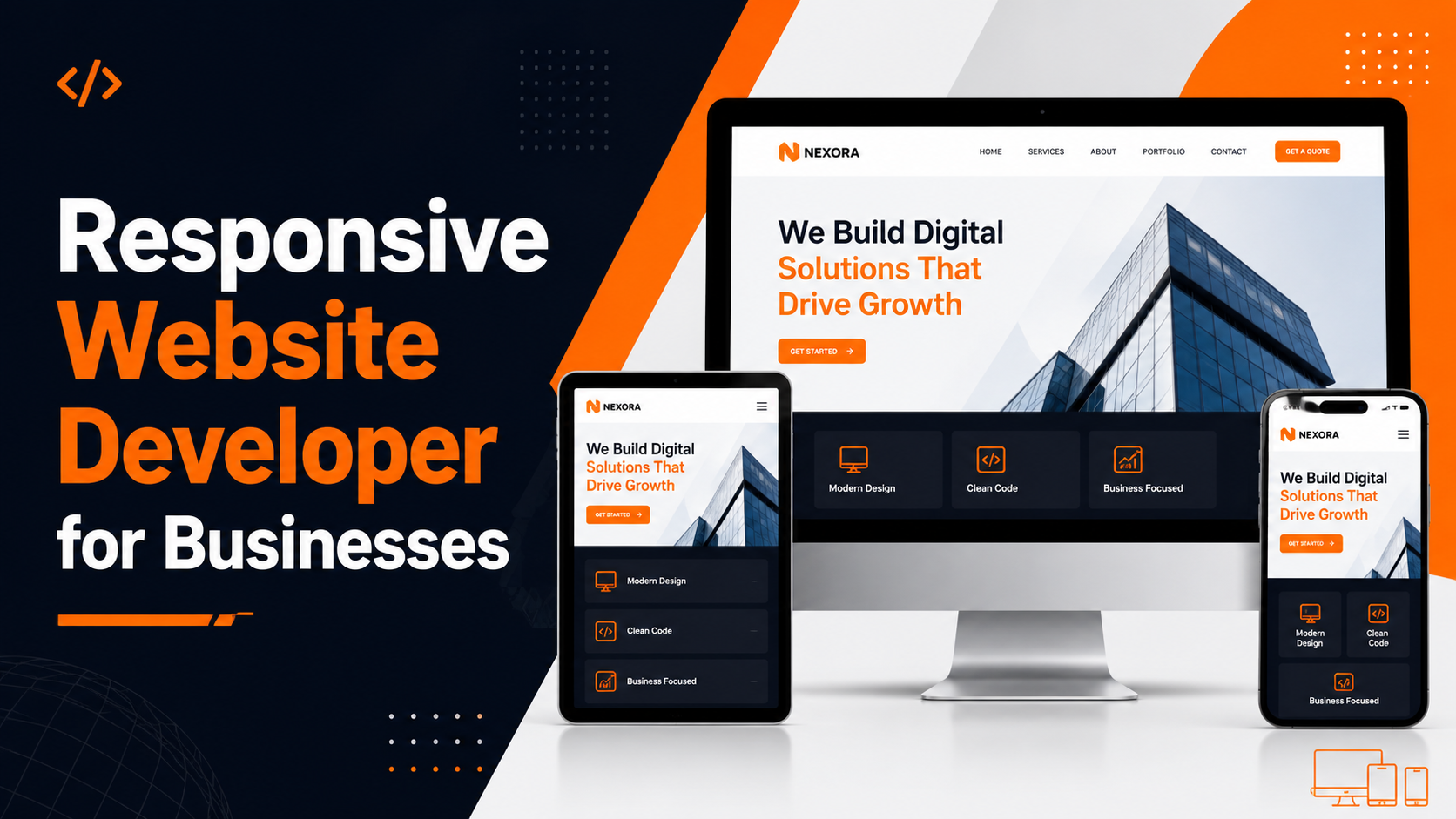
A Responsive Website Developer builds websites that work properly on mobile, tablet, laptop, and desktop screens. This is important because users may open your website from any device, and every visitor should get a clean, readable, and usable experience. A business website should not only look good on a large desktop screen; it should also work smoothly on a small mobile screen where many customers first discover the business.
If a website looks broken on mobile, has unreadable text, overlapping sections, slow loading images, or difficult navigation, users may leave before contacting the business. This can affect enquiries, trust, and overall website performance. A responsive website helps users read content, explore services, tap buttons, fill forms, and contact the business without friction.
For businesses, responsive design is not only a design requirement. It is part of user experience, SEO-friendly structure, lead generation, and digital credibility. A Website Developer Freelancer or Frontend Developer Freelancer should build pages that adapt naturally to different screen sizes instead of simply shrinking the desktop design.
Why responsive website development matters
Responsive Website Development improves user experience by making content readable, buttons usable, images flexible, and layouts clean across different screen sizes. A visitor should not need to zoom in, scroll sideways, or struggle with broken sections. The website should feel intentionally designed for mobile, tablet, laptop, and desktop users.
Many business visitors come from mobile sources such as Google Search, WhatsApp links, social media posts, ads, email campaigns, and shared URLs. These visitors often want information quickly. They may check services, read a few sections, look at contact options, and decide whether to submit an enquiry. If the mobile layout is weak, the business may lose that opportunity.
A Responsive Website Developer can plan layouts so each section adjusts properly. The hero section can stack on mobile. Service cards can move from three columns to one column. Images can resize correctly. Forms can become easier to fill. Navigation can become a mobile menu. These details make the website more practical for real users.
What responsive websites should include
A responsive website should include more than flexible width. It should have a complete mobile-friendly structure. Text should remain readable, headings should not break awkwardly, images should stay optimized, buttons should be easy to tap, and sections should have enough spacing. The layout should guide visitors naturally instead of making them work hard to understand the page.
Businesses should also consider how users behave on smaller screens. Mobile users usually scan quickly. They look for a clear headline, service information, trust signals, pricing or process hints, and contact options. A responsive layout should put the most important information where users can find it easily.
- Mobile-friendly navigation that works cleanly on smaller screens.
- Flexible grids and sections that adjust across devices.
- Readable text sizes for mobile, tablet, laptop, and desktop.
- Optimized images that load properly and resize correctly.
- Clear CTA buttons that are easy to tap.
- Forms that work on mobile without confusing fields.
- Consistent spacing across devices.
- Cards and content blocks that stack naturally on smaller screens.
- Responsive images, icons, menus, forms, and footer sections.
- Fast and lightweight frontend implementation.
Mobile-first thinking for business websites
Mobile-first thinking means planning the website for smaller screens before expanding it for larger screens. This approach is useful because many business users now visit websites from mobile devices first. A mobile-first design focuses on the most important content, clear CTAs, simple navigation, and easy reading.
On mobile, there is limited screen space. This means every section should have a clear purpose. A long paragraph may need to be broken into smaller sections. A large image may need to be resized or moved. A multi-column layout may need to become a single column. Buttons should be large enough to tap. Forms should have clear labels and simple fields.
A Business Website Developer should check whether the mobile version still communicates the service clearly. The website should not hide important content or push the contact button too far down. The mobile journey should be smooth from the first screen to the enquiry form.
Responsive design and SEO
Responsive design supports SEO-friendly website development because users get a better page experience across devices. Clean structure, headings, internal links, readable sections, and optimized images also support better crawlability. A website that works well on mobile can provide a stronger foundation for long-term organic visibility.
An SEO Friendly Website Developer should not treat SEO and responsive design as separate tasks. The layout affects how users read the page. If headings are unclear, sections are messy, or mobile content is difficult to read, users may leave quickly. A good responsive layout helps users stay longer and understand the service better.
Responsive websites should also include proper HTML structure, one clear H1, useful H2 headings, image alt text, internal links, and clean page URLs. These details make the website easier for users and search engines to understand. Responsive design works best when technical structure and content structure are planned together.
Responsive Website Developer for service pages
Service pages are important for business websites because they explain each offering in detail. A responsive service page should be easy to read on all devices. It should include a clear headline, service explanation, benefits, process, FAQs, trust signals, and contact CTA. On mobile, these sections should stack in a way that keeps the user engaged.
For example, a website development service page may include sections about business websites, responsive design, contact forms, SEO-friendly structure, WordPress, React, backend features, and project planning. A responsive layout helps users move through this information without feeling overwhelmed.
A Responsive Website Developer should also make sure CTA buttons are repeated at useful points. Visitors should have easy options to contact the business after reading important sections. This improves the enquiry flow and makes the page more practical.
Responsive landing pages for campaigns
Landing pages need responsive design because campaign traffic often comes from mobile devices. A visitor may click an ad, social media post, email link, or WhatsApp message and land directly on the page. The page has only a short time to communicate the offer and encourage action.
A responsive landing page should have a clear headline, short explanation, benefit sections, trust points, FAQs, and an easy form. The form should not be difficult to fill on mobile. CTA buttons should be visible and tappable. Images should support the message without slowing down the page.
A Landing Page Developer with responsive UI experience can create campaign pages that work across devices. This is useful for small businesses, service providers, consultants, agencies, startups, and local companies that want better enquiry flow from targeted pages.
Frontend development for responsive UI
A Frontend Developer Freelancer works on the visible interface of a website. This includes HTML, CSS, JavaScript, ReactJS, Tailwind CSS, Bootstrap, layouts, buttons, forms, cards, menus, and responsive behavior. Frontend development directly affects how a website feels to users.
Responsive UI needs careful frontend implementation. A developer should use flexible grids, relative sizing, breakpoints, optimized images, clean spacing, and tested components. The same section may need different layout behavior on mobile, tablet, and desktop. A simple example is a three-column service card section becoming a single-column list on mobile.
React can also support responsive interfaces through reusable components. A service card, project card, blog card, CTA block, FAQ section, and contact form can be built once and reused across pages. This helps maintain consistency across the website.
Common responsive website problems
Many websites look fine on desktop but fail on mobile. Common problems include small text, buttons that are too close together, images that overflow, sections that overlap, menus that do not open properly, forms that are hard to fill, and content that requires horizontal scrolling. These issues create friction for users.
Another common issue is inconsistent spacing. A website may have large gaps on desktop and crowded sections on mobile. Sometimes the homepage is responsive, but inner pages are not. Sometimes the design works on one phone size but breaks on another. A Responsive Website Developer should test multiple screen sizes to catch these issues.
Fixing responsive problems may require CSS updates, layout changes, image optimization, menu improvements, form adjustments, and component restructuring. A developer should identify the actual issue instead of applying quick fixes that create new layout problems elsewhere.
Responsive forms and contact sections
Contact forms are one of the most important parts of a business website. A responsive form should be easy to use on mobile and desktop. Field labels should be clear, input boxes should be large enough, buttons should be visible, and error messages should be readable.
A business form may include name, email, phone number, location, service type, and project details. On mobile, these fields should stack cleanly. The form should not feel too long or confusing. After submission, users should see a success message or thank-you page.
Responsive websites can also include mobile-friendly CTA buttons, phone links, WhatsApp buttons, enquiry buttons, and sticky contact sections when needed. These features can make it easier for visitors to contact the business quickly.
Website performance and responsive design
Responsive design and performance are connected. A website may technically adjust to mobile, but if it loads slowly, users may still leave. Large images, unnecessary animations, heavy scripts, and unoptimized assets can make a website slow on mobile networks.
A responsive website should use optimized images, clean CSS, reusable components, and only necessary scripts. The layout should not depend on heavy visual effects that reduce usability. A business website should look professional while staying practical and fast.
Frontend performance also supports SEO-friendly website development. A fast, readable, mobile-friendly page gives users a better experience. This is why a Responsive Website Developer should think about both layout and loading behavior.
Responsive WordPress and React websites
Responsive websites can be built with WordPress, React, HTML, CSS, Tailwind CSS, Bootstrap, or custom frontend code. WordPress is useful for CMS-based business websites where the owner wants to update content. React is useful for custom frontend pages, reusable components, route-based layouts, dashboards, and API-connected interfaces.
WordPress websites may need responsive theme customization. A default theme may not fit every business properly. A developer can adjust mobile menus, page sections, images, forms, and spacing. React websites may need component-level responsive design so repeated sections work across all pages.
The right technology depends on the business requirement. A simple service website may work well with WordPress. A custom portfolio or business website may work well with React. A dashboard or web application may need React with backend APIs. Responsive design should be part of every option.
What to check before hiring a Responsive Website Developer
Before you hire Frontend Developer or Responsive Website Developer support, review whether the developer has experience with mobile-friendly layouts, frontend structure, forms, responsive sections, image optimization, and business website pages. A good developer should be able to show websites that work properly across devices.
You should also discuss the pages that need responsive development. Some projects need a new responsive website. Others need fixes to an existing website. Some need responsive landing pages, WordPress layout improvements, React components, or mobile form fixes. Clear scope helps the developer identify the right work.
- Check whether the developer has responsive website examples.
- Ask whether mobile, tablet, laptop, and desktop layouts will be tested.
- Review experience with HTML, CSS, JavaScript, ReactJS, Tailwind CSS, and WordPress.
- Confirm whether contact forms and CTA sections will be mobile-friendly.
- Ask about image optimization and page performance.
- Check whether SEO-friendly headings, internal links, and image alt text are included.
- Ask whether existing non-responsive websites can be improved.
How DS Dev Studio can help
DS Dev Studio by Deepak Sharma can build responsive business websites, React pages, WordPress websites, landing pages, frontend sections, and custom UI layouts that work across screen sizes. The focus is on clean layout, readable content, mobile-friendly sections, practical CTA placement, and SEO-friendly structure.
Deepak Sharma Web Developer work includes frontend development, responsive UI, React components, WordPress customization, landing pages, business websites, backend features, admin panels, and custom web applications. This makes DS Dev Studio useful for businesses that need both professional visual presentation and practical website functionality.
To improve an existing non-responsive website or build a new mobile-friendly business website, DS Dev Studio can help plan the page structure, create responsive sections, optimize UI elements, improve contact forms, and prepare the website for users across devices.
Conclusion
A Responsive Website Developer helps make your website usable across all devices. A business website should not only look good on desktop; it should also work smoothly on mobile, tablet, laptop, and different browser sizes. Responsive Website Development improves readability, navigation, contact forms, CTA buttons, image behavior, page structure, user experience, and SEO-friendly layout. DS Dev Studio by Deepak Sharma can build and improve responsive websites, React pages, WordPress layouts, landing pages, frontend sections, and business website interfaces. Whether you need a new responsive website or improvements to an existing non-responsive layout, a mobile-friendly and user-focused design can make your website more professional, practical, and ready for business enquiries.
Useful internal links
Frequently asked questions
Can I hire Deepak Sharma as a Responsive Website Developer?+
Yes. You can hire Deepak Sharma for responsive business websites, React pages, WordPress customization, landing pages, frontend UI improvements, mobile-friendly forms, and website layout fixes.
Why is responsive design important?+
Responsive design ensures that your website works properly on mobile, tablet, laptop, and desktop devices. It improves readability, navigation, contact flow, and overall user experience.
Can DS Dev Studio fix non-responsive websites?+
Yes. DS Dev Studio can improve mobile layouts, spacing, sections, images, forms, buttons, menus, cards, typography, and responsive behavior for existing websites.
Is responsive design useful for SEO?+
Yes. Responsive design supports better user experience, readable content, mobile usability, clean structure, and SEO-friendly website development when combined with proper headings, metadata, and internal links.
Can responsive websites include contact forms?+
Yes. Responsive websites can include mobile-friendly contact forms, enquiry forms, CTA buttons, thank-you pages, email notifications, phone links, and WhatsApp contact options.