Responsive Website Developer Guide for Better Mobile User Experience
A practical guide for businesses that want to hire a Responsive Website Developer for better mobile user experience, responsive layouts, landing pages, service pages, business websites, and frontend development.

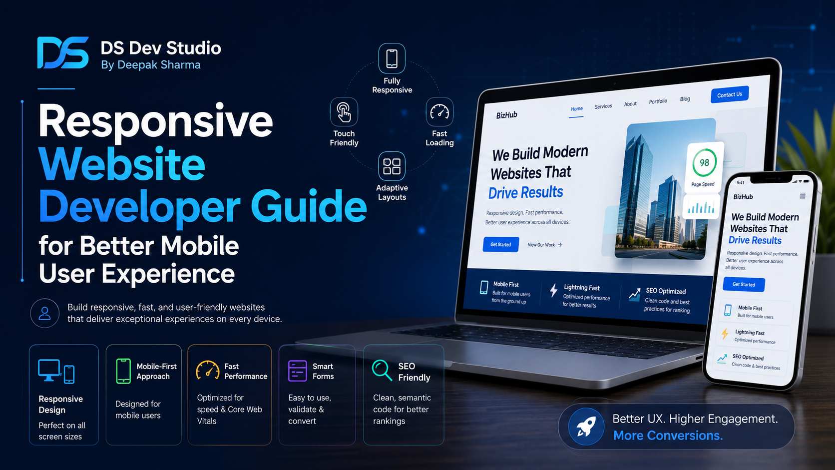
A Responsive Website Developer helps businesses build websites that work properly on mobile, tablet, laptop, and desktop screens. In today’s online environment, a website cannot be designed only for large desktop screens. Many users open business websites from mobile phones through Google Search, WhatsApp links, social media, email campaigns, ads, and direct referrals. If the mobile experience is weak, visitors may leave before reading services or submitting an enquiry.
Responsive Website Development means the website layout adjusts according to screen size. Text should remain readable, images should resize correctly, buttons should be easy to tap, menus should work smoothly, forms should be simple to fill, and page sections should not break on smaller screens. A responsive website gives users a smoother experience and helps businesses present a professional image across devices.
For small businesses, service providers, agencies, consultants, startups, local companies, and professional brands, mobile user experience is directly connected to trust and enquiries. A visitor may judge the business within a few seconds. If the website looks broken, slow, crowded, or difficult to use on mobile, the user may not continue. A skilled Responsive Website Developer can prevent these issues by planning mobile-friendly layouts from the beginning.
DS Dev Studio by Deepak Sharma helps businesses with responsive website development, mobile-friendly UI, frontend development, React websites, WordPress customization, landing pages, service pages, business websites, backend systems, admin panels, and custom web applications. This guide explains how a Responsive Website Developer can improve mobile user experience and what businesses should check before hiring one.
What does a Responsive Website Developer do?
A Responsive Website Developer builds websites that adjust properly across different screen sizes. The developer works on layout structure, mobile navigation, flexible grids, readable typography, image resizing, button spacing, form layout, page speed, and device testing. The goal is to make the website easy to use whether someone opens it on a small phone or a large desktop monitor.
Responsive development is not only about shrinking the desktop layout. A mobile screen has less space, different touch behavior, and different user expectations. A section that looks good in three desktop columns may need to become a single column on mobile. A large hero image may need to move below the text. A navigation menu may need to become a hamburger menu. A contact form may need full-width fields and larger tap areas.
A good Website Developer Freelancer should understand how users actually move through a mobile website. The developer should check whether users can read the headline, open the menu, scroll comfortably, tap CTA buttons, submit forms, and find contact details without confusion. Responsive Website Development is about usability, not only visual adjustment.
Why mobile user experience matters for business websites
Mobile user experience matters because many visitors first discover a business on mobile. A user may search for a service, open a website, scan the homepage, check services, and contact the business within a short time. If the mobile layout is difficult, the user may leave before taking action. This can reduce enquiries even when the business offers good services.
A mobile-friendly website also improves trust. When users see clean sections, readable text, clear buttons, and smooth navigation, they feel more comfortable exploring the website. A broken mobile layout can make the business look careless or outdated. For small businesses, this first impression is important because the website often works as the first digital meeting point.
Mobile user experience also supports SEO-friendly website development. A website that loads fast, works well on mobile, has clear content, and gives users a better experience is stronger than a website that only looks good on desktop. A Responsive Website Developer should build pages that support both users and search visibility.
What makes a website responsive?
A responsive website uses flexible layouts, scalable images, readable typography, and screen-size-based styling. Instead of fixing every section at one desktop width, the website adjusts according to available space. This allows the same website to work across mobile phones, tablets, laptops, and desktops.
Responsive design includes flexible grids, breakpoints, mobile-friendly menus, adaptive spacing, image optimization, and touch-friendly buttons. Breakpoints are screen width points where the layout changes. For example, a four-column service section on desktop may become two columns on tablet and one column on mobile.
A Responsive Website Developer should also test real content. A layout may look responsive with short sample text but break when real headings, long service names, or actual images are added. Responsive testing should happen with real website content, not only placeholder sections.
- Flexible page layouts that adjust across screen sizes.
- Readable text on mobile without zooming.
- Images that resize without breaking sections.
- Navigation menus that work smoothly on small screens.
- CTA buttons with enough touch space.
- Forms that are easy to complete on mobile.
- Service cards and project cards that stack properly.
- Fast loading pages with optimized assets.
- Consistent spacing across mobile, tablet, and desktop.
- Testing across different browsers and device widths.
Mobile-first design vs desktop-first design
Mobile-first design means planning the mobile experience before the desktop layout. This approach is useful because mobile screens have limited space. When a website is clear on mobile, it is usually easier to expand the layout for larger screens. A mobile-first approach forces the developer and business to focus on essential content and actions.
Desktop-first design starts with the large-screen layout and then adjusts it for smaller screens. This can still work when handled properly, but many websites fail because the mobile version is treated as a final adjustment. Important content may become crowded, images may become too large, and forms may become difficult to use.
For business websites, a balanced approach is best. The website should look professional on desktop, but the mobile layout should not be an afterthought. A Responsive Website Developer should plan how each section behaves on different screens from the beginning of the project.
Responsive homepage development
The homepage is often the first page users see, so it needs a strong responsive layout. On mobile, the homepage should quickly explain who the business is, what services are offered, and how users can contact the business. The headline should be readable, the CTA button should be visible, and the important sections should appear in a logical order.
A desktop homepage may have a wide hero section with text on one side and an image on the other. On mobile, this section may need to stack vertically. The text should come first if it explains the business clearly. The CTA button should be easy to tap. Images should be optimized so they do not slow down the page.
A Business Website Developer should also make sure homepage service sections, testimonials, project cards, blog previews, and contact sections look clean on mobile. If these sections are too crowded, users may skip them. A responsive homepage should guide users smoothly from introduction to action.
Responsive service pages
Service pages are important for business websites because they explain what the business offers. A responsive service page should be easy to read on mobile. Users should not struggle with tiny text, oversized images, broken cards, or confusing section order. The page should explain the service clearly and guide users toward an enquiry.
A good service page may include a clear heading, introduction, benefits, process, features, FAQs, related services, and contact CTA. On mobile, each section should have enough spacing and readable text. Lists should not feel cramped. CTA buttons should appear after important sections where users may be ready to contact.
A Website Developer Freelancer should create reusable service page layouts that remain responsive across different service topics. For example, pages for website development, React frontend development, WordPress development, backend development, and API integration can follow a consistent responsive structure while using unique content.
Responsive landing pages
Landing pages need strong mobile user experience because many campaign visitors come from mobile devices. A landing page usually has one main goal, such as getting a quote request, booking a call, collecting a lead, or promoting a service. The layout should guide users toward that goal without unnecessary distractions.
A responsive landing page should include a clear headline, short explanation, benefit sections, trust points, CTA buttons, FAQs, and a mobile-friendly form. The form should not be too long. The submit button should be clear. Important information should appear before users lose interest.
A Landing Page Developer with responsive design skills can create campaign pages that work across mobile and desktop. This is useful for businesses running ads, social media promotions, WhatsApp campaigns, email campaigns, or local service offers.
Mobile-friendly navigation
Navigation is one of the most important parts of mobile user experience. A desktop menu may show all links in one row, but a mobile screen needs a simpler menu structure. The mobile menu should open easily, show clear links, and allow users to move between pages without confusion.
Common mobile navigation issues include menus that do not open, links that are too small, dropdowns that are difficult to tap, hidden contact links, and menus that cover the full page without clear close buttons. These issues can frustrate users and stop them from exploring the website.
A Responsive Website Developer should test the navigation carefully. Important links such as Services, Projects, Blog, and Contact should be easy to find. If the business relies on enquiries, a contact button or call-to-action should be visible in the mobile navigation or near important sections.
Mobile-friendly forms and enquiry flow
Forms are critical for business websites because they turn visitors into enquiries. A form may collect name, email, phone number, service requirement, budget, timeline, or message. On mobile, forms should be simple, readable, and easy to complete. If the form feels difficult, users may abandon it.
Form fields should be full-width on mobile, labels should be clear, spacing should be comfortable, and the submit button should be easy to tap. Error messages should explain what needs to be fixed. The form should also show a success message after submission so users know their enquiry was received.
A Responsive Website Developer can also connect forms with backend systems, email notifications, Google Sheets, or CRM dashboards where needed. This improves the enquiry flow and helps businesses manage leads properly after users submit the form.
Responsive typography and readability
Typography affects mobile user experience more than many businesses realize. If text is too small, users struggle to read. If headings are too large, they break awkwardly. If line spacing is too tight, paragraphs feel crowded. Responsive typography makes content easier to read on every screen.
A mobile-friendly website should use font sizes that are readable without zooming. Paragraphs should be broken into comfortable lengths. Headings should create clear structure. Buttons and labels should be easy to understand. Content should feel natural to scan because many mobile users scroll quickly.
An SEO Friendly Website Developer should also use headings properly. The page should have a clear H1 and useful H2 sections. This helps users understand the page structure and supports SEO-friendly content organization. Good typography supports both readability and search structure.
Images and media in responsive websites
Images can improve a website, but they can also create problems if not optimized. Large images can slow down mobile loading. Images with fixed width can break layouts. Banner images may crop important text or visuals on small screens. A Responsive Website Developer should manage images carefully.
Images should resize according to the container, maintain good quality, and load efficiently. Decorative images should not push important content too far down the mobile page. Service images, project images, and blog images should have descriptive alt text where relevant. This supports accessibility and SEO-friendly website development.
For business websites, images should support the message. A mobile layout should not depend on large visuals alone. Text, CTA buttons, and contact options should remain clear even when images are stacked or resized.
Responsive design for React websites
React websites can be highly responsive when components are planned correctly. A React Developer Freelancer can build reusable components such as headers, hero sections, service cards, blog cards, contact forms, FAQs, and dashboards. Each component should be responsive on its own because it may be reused across multiple pages.
If a service card component breaks on mobile, every page using that component may also break. This is why responsive testing is important at the component level. React frontend development should include mobile-friendly layout logic, flexible CSS, and clean component structure.
React can also support dynamic sections, API-connected content, dashboards, and custom interfaces. These features should still work smoothly on smaller screens. A responsive React website should combine clean UI, fast loading, reusable components, and practical mobile behavior.
Responsive design for WordPress websites
WordPress websites can be responsive, but they still need proper testing and customization. Many themes claim to be mobile-friendly, but real content can create layout issues. Long headings, large images, page builder sections, plugin widgets, and custom blocks can break mobile design if not handled carefully.
A WordPress Developer Freelancer should check the website on mobile after adding real pages and content. The homepage, service pages, blog pages, contact page, menus, forms, and footer should all work properly. Responsive fixes may require theme settings, CSS adjustments, page builder changes, or custom code.
For small businesses, WordPress can be a practical choice because it allows content management. But the website should still be mobile-friendly, fast, clean, and easy to update. Responsive design should not be ignored after installing a theme.
Responsive website speed and performance
Mobile user experience depends heavily on speed. A website may be responsive visually but still perform poorly if pages load slowly. Large images, too many scripts, heavy plugins, unnecessary animations, and unoptimized code can make the mobile experience weak.
A Responsive Website Developer should optimize frontend structure, compress images, avoid unnecessary libraries, reduce heavy effects, and keep pages lightweight. For WordPress websites, plugin management and caching may also be important. For React websites, component structure and asset optimization matter.
Fast mobile loading helps users stay on the website. If a visitor clicks from search or social media and the page loads slowly, they may leave before reading anything. Performance should be part of responsive development from the beginning.
Responsive design and SEO-friendly website development
Responsive design supports SEO-friendly website development because it improves user experience and page accessibility across devices. A website that works properly on mobile is easier for visitors to read, navigate, and use. This can support better engagement and reduce frustration.
SEO-friendly responsive websites should include clear headings, useful content, internal links, optimized images, fast loading, readable text, and mobile-friendly layout. Service pages should explain offerings clearly. Blog pages should be easy to read. Contact forms should work properly. Internal links should help users move between related pages.
A SEO Friendly Website Developer should not treat SEO and responsive design as separate tasks. They work together. A page with good content but poor mobile layout may still fail users. A page with attractive design but weak headings and content may not perform well as a business asset.
Responsive testing before website launch
Testing is an important part of Responsive Website Development. A website should not be launched after checking only one desktop screen. The developer should test the website on different screen widths and browsers. Mobile menus, forms, buttons, images, cards, headings, footers, and CTA sections should all be checked.
Testing should include real user actions. Can the user open the menu? Can they read the service page? Can they tap the CTA button? Can they submit the form? Can they move from blog to service page? Can they find contact details? These questions matter more than simply checking whether the page appears on mobile.
A Website Developer Freelancer should fix issues before launch and also review the website after future content updates. A responsive layout can break later if new images, long headings, extra sections, or plugins are added without testing.
Common responsive website mistakes to avoid
One common mistake is designing only for desktop and treating mobile as a quick adjustment. This often leads to cramped sections, broken images, small buttons, and difficult forms. Mobile layout should be planned from the beginning, especially for business websites that depend on enquiries.
Another mistake is using fixed widths everywhere. Fixed-width sections can cause horizontal scrolling on mobile. Users should not need to move sideways to read content. Flexible containers and responsive grids should be used so sections adapt naturally.
Other mistakes include hiding important content on mobile, using too many animations, placing CTA buttons too far down, creating long forms, using unreadable font sizes, ignoring page speed, and not testing after updates. A Responsive Website Developer should identify these issues and fix them before launch.
What to prepare before hiring a Responsive Website Developer
Before hiring a Responsive Website Developer, prepare your website goals, required pages, service details, logo, brand colors, images, contact information, content, and reference websites. Also explain whether you need a new website, redesign, mobile fixes, landing pages, service pages, React development, WordPress customization, or full website development.
If you already have a website, share the current problems. For example, the menu may not work on mobile, forms may look broken, pages may load slowly, text may be too small, service cards may overflow, or images may not resize properly. Clear problem details help the developer review and fix issues faster.
- Prepare your required pages such as Home, Services, Blog, Projects, and Contact.
- Share your logo, brand colors, content, images, and contact details.
- List mobile issues if you already have a website.
- Clarify whether you need React, WordPress, HTML, CSS, or custom development.
- Prepare reference websites for design direction.
- Discuss forms, CTA buttons, enquiry flow, and backend connection if needed.
- Ask for mobile, tablet, laptop, and desktop testing.
- Clarify timeline, revisions, deployment, maintenance, and future updates.
What to check before hiring a developer
Before hiring a developer, check whether they understand responsive layouts, mobile UI, frontend development, website structure, forms, performance, SEO-friendly headings, and device testing. A developer should be able to explain how they make websites work across mobile, tablet, laptop, and desktop screens.
Review previous work on both desktop and mobile. Do not judge only by screenshots. Open the website and test menu, buttons, forms, service sections, blog pages, and contact page. Check whether the website feels easy to use on a phone. A real responsive website should work in practice, not only in preview images.
Also ask about technologies. A Frontend Developer Freelancer may use HTML, CSS, JavaScript, React, Tailwind CSS, or Bootstrap. A WordPress Developer Freelancer may customize themes and page builder sections. A Custom Website Developer may combine frontend and backend work. The right choice depends on your project requirement.
How DS Dev Studio can help
DS Dev Studio by Deepak Sharma can help businesses with responsive website development, mobile-friendly UI, React frontend development, WordPress customization, business websites, landing pages, service pages, contact forms, frontend improvements, website redesign, and custom web development.
Deepak Sharma Web Developer work includes HTML, CSS, JavaScript, ReactJS, responsive UI, WordPress websites, PHP backend development, Laravel and CodeIgniter systems, MySQL database workflows, API integrations, admin panels, CRM modules, and custom web applications. This is useful for businesses that need both mobile-friendly public pages and practical technical functionality.
If you want to hire a Responsive Website Developer for better mobile user experience, DS Dev Studio can help review your current website, fix mobile layout issues, build responsive pages, improve forms, optimize service sections, create React or WordPress layouts, and prepare the website for better user experience across devices.
Conclusion
A Responsive Website Developer helps businesses create websites that work smoothly across mobile, tablet, laptop, and desktop screens. Better mobile user experience is important because many visitors first open business websites from phones. A responsive website should have readable text, mobile-friendly menus, flexible sections, optimized images, fast loading, simple forms, clear CTA buttons, and SEO-friendly structure. Whether the project is a business website, landing page, service page, React website, WordPress website, or custom website, responsive design should be planned from the beginning. DS Dev Studio by Deepak Sharma can help businesses with responsive website development, mobile UI improvements, React frontend development, WordPress customization, service pages, landing pages, website redesign, contact forms, and custom web development. With the right responsive development approach, a website becomes easier to use, more professional, and better prepared to support enquiries and long-term growth.
Useful internal links
Frequently asked questions
Can I hire Deepak Sharma as a Responsive Website Developer?+
Yes. You can hire Deepak Sharma for responsive website development, mobile-friendly layouts, React frontend development, WordPress customization, landing pages, service pages, business websites, and website redesign.
What does a Responsive Website Developer do?+
A Responsive Website Developer builds websites that work properly on mobile, tablet, laptop, and desktop screens with flexible layouts, readable text, mobile navigation, optimized images, touch-friendly buttons, and easy-to-use forms.
Why is responsive design important for business websites?+
Responsive design is important because many users visit business websites from mobile devices. A responsive website improves readability, navigation, contact flow, trust, user experience, and enquiry chances.
Can DS Dev Studio fix mobile layout issues on an existing website?+
Yes. DS Dev Studio can review existing websites and fix mobile layout issues, broken menus, difficult forms, image problems, spacing issues, slow pages, and responsive design problems.
Is responsive website development good for SEO?+
Yes. Responsive website development supports SEO-friendly structure by improving mobile usability, readability, page experience, internal navigation, image optimization, and overall user experience.