Why Every Small Business Needs Responsive Website Development
A practical guide explaining why responsive website development is important for small businesses that need mobile-friendly layouts, clean UI, SEO-friendly pages, and better customer enquiries.

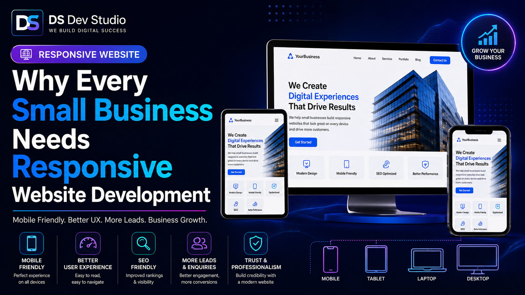
Responsive Website Development is no longer optional for small businesses. Today, customers open websites from mobile phones, tablets, laptops, desktops, and different browser sizes. A website that looks good only on a desktop screen can still fail if the mobile layout is broken, the text is too small, the buttons are hard to tap, or the contact form is difficult to use.
For a small business, the website is often the first serious impression customers see before calling, sending a message, filling out a form, or visiting a store. If the website does not work properly on mobile, the business may lose trust before the visitor even understands the service. This is why hiring a Responsive Website Developer is important for service providers, local businesses, consultants, freelancers, startups, and growing companies.
A responsive website adjusts itself according to screen size. The same website can display cleanly on mobile, tablet, laptop, and desktop without forcing users to zoom, scroll sideways, or struggle with overlapping sections. Good Responsive Website Development makes content readable, navigation simple, images flexible, forms usable, and CTA buttons easy to click.
Small businesses need responsive websites because customers want quick information. They want to know what you offer, where you work, how to contact you, what makes you reliable, and whether your service fits their requirement. A responsive website helps deliver this information clearly across every device.
What is Responsive Website Development?
Responsive Website Development is the process of building websites that adapt to different screen sizes and devices. Instead of creating one separate website for desktop and another for mobile, responsive development uses flexible layouts, grids, CSS breakpoints, scalable images, and adaptive sections so the same website works across devices.
In simple terms, responsive development makes sure your website looks and works properly whether someone opens it from an iPhone, Android phone, tablet, small laptop, large desktop monitor, or resized browser window. The layout should adjust naturally without breaking the user experience.
A Responsive Website Developer works on the frontend structure of the website. This includes header, navigation, hero section, service cards, text blocks, images, forms, footer, buttons, spacing, typography, and mobile menu behavior. The developer makes sure each section responds correctly when the screen size changes.
For small businesses, responsive development is important because the website must work for real users, not only look good in a design preview. Users may open the website while travelling, sitting in an office, browsing from home, or checking a link shared on WhatsApp. The website should be ready for all these situations.
Why small businesses cannot ignore mobile users
Many small business customers first visit a website from a mobile phone. They may find the website through Google Search, social media, WhatsApp, Instagram, Facebook, Google Business Profile, ads, email links, or referrals. In most of these cases, mobile is the first device they use to check the business.
If the mobile experience is poor, the visitor may leave quickly. They may not wait for the website to load properly. They may not zoom in to read tiny text. They may not search for a hidden contact button. They may simply return to search results and choose another business with a better website experience.
For small businesses, this can directly affect enquiries. A local service provider, consultant, coaching institute, freelancer, agency, clinic, restaurant, repair service, or professional brand can lose potential customers if the website does not support mobile browsing. A mobile-friendly website makes the customer journey easier.
A Website Developer for Small Business should always plan the website for mobile users. This means clear headings, short readable sections, fast loading images, simple menus, easy-to-tap buttons, and contact forms that work smoothly on smaller screens.
Responsive design improves user experience
User experience is one of the biggest reasons small businesses need responsive websites. A visitor should be able to read, navigate, understand, and contact the business without confusion. Responsive design helps by making the page layout comfortable across all devices.
Good user experience includes readable text, clear spacing, properly sized images, visible buttons, easy navigation, and simple forms. If a user has to work too hard to understand the website, the experience becomes weak. A strong responsive website removes this friction.
For example, a service section with three cards may look good on desktop. On mobile, those cards should stack one below another. A large hero image may look impressive on desktop, but on mobile it may need to resize or move below the text. A long menu may work on desktop, but on mobile it should become a clean hamburger menu.
A Frontend Developer Freelancer can handle these layout decisions carefully. The goal is not only to make the website fit the screen. The goal is to make the website feel natural and easy to use on every screen.
Responsive websites support trust and professionalism
A small business website represents the professionalism of the business. If the layout is broken on mobile, users may assume the business is outdated or careless. Even if the service quality is good, the website can create a weak first impression when it does not work properly.
A responsive website creates a more professional experience. It shows that the business has invested in a proper digital presence. Users can view services, read content, check examples, and contact the business smoothly. This builds more confidence than a website that feels unfinished or difficult to use.
Trust is especially important for small businesses because customers may not already know the brand. A clean responsive website can help show credibility through service pages, project examples, testimonials, FAQs, contact details, and clear business information.
A Business Website Developer should create a website that supports trust from the first screen. The website should look clean, load properly, explain the business clearly, and give visitors confidence to take the next step.
Responsive Website Development and SEO-friendly structure
Responsive Website Development supports SEO-friendly website development because mobile usability and user experience are important for modern websites. A website that works properly across devices gives users a better experience and creates a stronger foundation for organic visibility.
An SEO Friendly Website Developer should not only focus on keywords. The developer should also think about page structure, headings, metadata, internal links, image alt text, content readability, page speed, and mobile layout. These elements work together to make a website easier for users and search engines to understand.
For small business websites, SEO-friendly structure often starts with clear service pages. Each important service should have its own page or section with a proper heading, useful explanation, CTA, FAQs, and internal links. Responsive design ensures that these pages remain readable and usable on mobile devices.
Clean structure also helps website visitors move from one page to another. A blog can link to a service page. A service page can link to a contact page. A project page can link to relevant services. Responsive layout keeps this internal journey smooth across devices.
How responsive design affects lead generation
Small businesses build websites to create visibility, trust, and enquiries. Responsive design directly affects lead generation because users are more likely to contact a business when the website is easy to use. If the contact form works smoothly and CTA buttons are visible, the website can support better enquiry flow.
On mobile, contact flow becomes even more important. Users may want to call, send WhatsApp message, submit an enquiry form, or quickly check contact details. If these actions are hidden or difficult, the business may lose potential leads. A responsive layout should place contact options where users can find them easily.
A landing page, for example, should have a clear headline, strong CTA, short benefit sections, trust points, FAQs, and a mobile-friendly form. If the page is not responsive, campaign visitors may leave before submitting details. This affects ad performance, local promotions, and service-based lead generation.
A Responsive Website Developer can improve lead generation by making forms simple, buttons visible, sections readable, and page flow clear. These practical improvements can make a real difference for small businesses.
Important features of a responsive business website
A responsive business website should include all the basic elements needed for good user experience. The website should not only adjust visually; it should remain useful. Every page should be easy to read, navigate, and act on.
The exact features depend on the business, but most small business websites need mobile-friendly navigation, flexible sections, readable typography, optimized images, contact forms, CTA buttons, service pages, project sections, FAQs, and internal links. These features help users understand the business and contact it easily.
- Mobile-friendly navigation with clear menu items.
- Flexible grids and sections that adapt across devices.
- Readable font sizes for mobile, tablet, laptop, and desktop.
- Optimized images that resize and load properly.
- CTA buttons that are easy to tap on smaller screens.
- Contact forms that work smoothly on mobile.
- Service pages with clear headings and useful content.
- Internal links between blogs, services, projects, and contact pages.
- Footer sections with phone, email, links, and social profiles.
- Fast and lightweight frontend implementation.
Common problems in non-responsive websites
Many small business websites look acceptable on desktop but fail on mobile. This usually happens when the website was built without proper responsive planning. The desktop layout is created first, but the mobile layout is ignored or only adjusted at the end.
Common problems include text that is too small, images overflowing the screen, sections overlapping, buttons being too close together, forms breaking on mobile, navigation menus not opening properly, and pages requiring horizontal scrolling. These issues make the website frustrating for users.
Another common problem is inconsistent spacing. Some sections may have too much gap on desktop and too little gap on mobile. Cards may not align properly. Images may become stretched. Footer links may become difficult to tap. These details may look small, but they affect user trust.
A Website Developer Freelancer can fix these problems by reviewing the layout, updating CSS, adjusting breakpoints, optimizing images, improving mobile navigation, and restructuring sections where needed.
Responsive design for service pages
Service pages are important for small businesses because they explain what the business offers. A responsive service page should be easy to read and understand on every device. Visitors should be able to scan the service, understand benefits, read FAQs, and contact the business without confusion.
For example, a business website development service page may include sections for website planning, responsive design, WordPress customization, React development, contact forms, SEO structure, and backend features. On mobile, these sections should stack cleanly and keep the reading experience smooth.
A service page should also include clear CTA buttons. After reading about the service, users should have an easy way to contact the business. A responsive layout can place CTA sections at useful points so users do not need to search for contact details.
A Business Website Developer should build service pages with both content and layout in mind. The page should explain the service properly while remaining visually clean and mobile-friendly.
Responsive design for landing pages
Landing pages are often used for campaigns, ads, special offers, lead generation, and service promotions. Since many visitors open landing pages from mobile ads or shared links, responsive design is especially important. A landing page that is not mobile-friendly can reduce campaign performance.
A responsive landing page should have a focused headline, short explanation, benefit sections, proof points, FAQs, contact form, and CTA buttons. The layout should remove distractions and guide visitors toward one action. On mobile, the message should appear clearly without making users scroll through unnecessary content first.
A Frontend Developer Freelancer can build landing pages with HTML, CSS, JavaScript, React, Tailwind CSS, Bootstrap, WordPress, or other tools depending on the project. The most important thing is that the page is fast, clear, responsive, and focused on the campaign goal.
For small businesses, responsive landing pages can be used for website development services, local promotions, coaching admissions, real estate leads, consulting offers, appointment bookings, and product or service campaigns.
Responsive design for contact forms
Contact forms are one of the most important parts of a business website. A responsive form should be easy to fill from both mobile and desktop. Field labels should be clear, input boxes should be large enough, and the submit button should be easy to tap.
Small businesses should avoid making forms too long. A basic enquiry form can include name, email, phone number, service requirement, location, and message. If the form asks for too many details, mobile users may avoid completing it. The form should collect enough information without becoming difficult.
After submission, users should see a clear success message or a thank-you page. If possible, email notifications can be sent to the business so enquiries are not missed. A responsive website should make this complete flow smooth and reliable.
Performance matters in responsive websites
A responsive website should also be fast. A layout may be mobile-friendly, but if the website loads slowly, users may still leave. Large images, unnecessary scripts, heavy animations, and poor frontend structure can reduce performance, especially on mobile networks.
A Responsive Website Developer should optimize images, reduce unnecessary code, use clean CSS, manage scripts carefully, and avoid heavy design elements that do not add real value. Visual quality is important, but performance should not be ignored.
For small businesses, performance is practical. A fast website helps users reach information quickly. It also supports SEO-friendly development and improves the overall experience. A slow website can make a professional business look unreliable.
Responsive WordPress websites
WordPress websites are common for small businesses because they allow easier content management. However, not every WordPress theme is automatically well-optimized for responsive design. Some themes look good in demos but become difficult to use after real content, images, forms, and plugins are added.
A developer can improve responsive WordPress layouts by adjusting sections, menus, images, forms, buttons, spacing, and typography. WordPress customization can also include service pages, landing pages, blog layouts, contact forms, and SEO-friendly settings.
Small businesses using WordPress should still check the mobile version carefully. The website should not only work in the editor preview; it should work properly when opened by real users on mobile browsers.
Responsive React websites
React is useful for custom frontend websites and web applications. A React website can use reusable components for service cards, project cards, blog cards, FAQs, forms, CTA sections, headers, and footers. This helps maintain consistent responsive behavior across the website.
A React Developer Freelancer can build responsive components that adjust across screen sizes. For example, the same card component can appear in a three-column layout on desktop, two-column layout on tablet, and single-column layout on mobile. This keeps the website clean and easier to maintain.
React is also useful when the website needs dashboards, API-connected sections, admin interfaces, or dynamic content. Responsive planning is important here because interactive screens can become complex on smaller devices.
How to check if your website is responsive
Business owners can do a basic responsive check without technical tools. Open your website on your mobile phone and check whether the text is readable, buttons are easy to tap, images fit the screen, menu works correctly, and contact form is usable. Then check the same website on a tablet or laptop if available.
You can also resize your browser window on desktop to see how the layout changes. If sections overlap, text breaks strangely, images overflow, or the layout requires horizontal scrolling, the website needs responsive improvements.
A developer can perform a deeper responsive audit by checking CSS breakpoints, layout containers, image sizes, mobile navigation, form behavior, performance, and browser compatibility. This helps identify problems that may not be obvious at first glance.
When should you hire a Responsive Website Developer?
You should hire a Responsive Website Developer when your website looks broken on mobile, users complain about navigation, contact forms are hard to fill, pages load slowly, or the design does not adjust properly across devices. You should also hire one when building a new website so responsive structure is included from the beginning.
If your existing website was built years ago, it may need responsive improvements. Older websites often use fixed-width layouts, outdated themes, large images, and non-mobile-friendly sections. Updating the website can improve both user experience and business credibility.
To hire Frontend Developer support, check whether the developer has experience with responsive UI, HTML, CSS, JavaScript, React, Tailwind CSS, WordPress customization, forms, landing pages, and business website structure. These skills are useful for creating practical responsive websites.
Responsive website development checklist for small businesses
Before launching or improving a business website, use a simple responsive checklist. This helps make sure the website works for real users and not only in one design view. A website should be tested from the perspective of a customer who wants to understand the business and contact it quickly.
- Check homepage layout on mobile, tablet, laptop, and desktop.
- Make sure service pages are readable on smaller screens.
- Test contact forms from mobile devices.
- Check CTA buttons for size, spacing, and visibility.
- Make sure images resize properly and do not overflow.
- Test mobile navigation and footer links.
- Review text size, heading structure, and section spacing.
- Check page speed and image loading behavior.
- Review internal links between services, blogs, projects, and contact pages.
- Confirm that important contact details are easy to find.
How DS Dev Studio can help
DS Dev Studio by Deepak Sharma can help small businesses with Responsive Website Development, business website development, React pages, WordPress customization, landing pages, frontend sections, contact forms, and SEO-friendly layouts. The focus is on building websites that are clean, practical, mobile-friendly, and aligned with business goals.
Deepak Sharma Web Developer work includes responsive UI, React components, WordPress websites, PHP backend systems, landing pages, admin panels, CRM modules, API integration, and custom web applications. This is useful for businesses that need both professional frontend development and practical website functionality.
If your current website is not responsive or you want to build a new mobile-friendly website, DS Dev Studio can help plan the structure, create responsive sections, optimize the layout, improve forms, and prepare the website for real users across devices.
Conclusion
Every small business needs Responsive Website Development because customers expect websites to work smoothly on every device. A responsive website improves mobile usability, user experience, trust, SEO-friendly structure, lead generation, and overall business credibility. It helps visitors read service pages, explore content, tap CTA buttons, fill contact forms, and understand the business without frustration. For small businesses, a mobile-friendly website can make the difference between a visitor leaving and a visitor submitting an enquiry. DS Dev Studio by Deepak Sharma can help build and improve responsive websites, React pages, WordPress layouts, landing pages, business website sections, and custom frontend interfaces. A responsive website is not only a technical improvement; it is a practical investment in better customer experience and stronger online presence.
Useful internal links
Frequently asked questions
Why does every small business need responsive website development?+
Every small business needs responsive website development because customers open websites from mobile, tablet, laptop, and desktop devices. A responsive website improves readability, navigation, contact flow, user experience, and trust.
Can I hire Deepak Sharma as a Responsive Website Developer?+
Yes. You can hire Deepak Sharma for responsive business websites, React pages, WordPress customization, landing pages, mobile-friendly forms, frontend UI improvements, and website layout fixes.
Is responsive website development useful for SEO?+
Yes. Responsive website development supports SEO-friendly structure by improving mobile usability, readability, internal navigation, page experience, and access to important website content across devices.
Can DS Dev Studio fix an existing non-responsive website?+
Yes. DS Dev Studio can improve mobile layouts, spacing, buttons, images, contact forms, navigation, service sections, WordPress layouts, React components, and responsive behavior.
What technologies are used for responsive website development?+
Responsive website development can use HTML, CSS, JavaScript, ReactJS, Tailwind CSS, Bootstrap, WordPress, PHP, and custom frontend development depending on the project requirement.